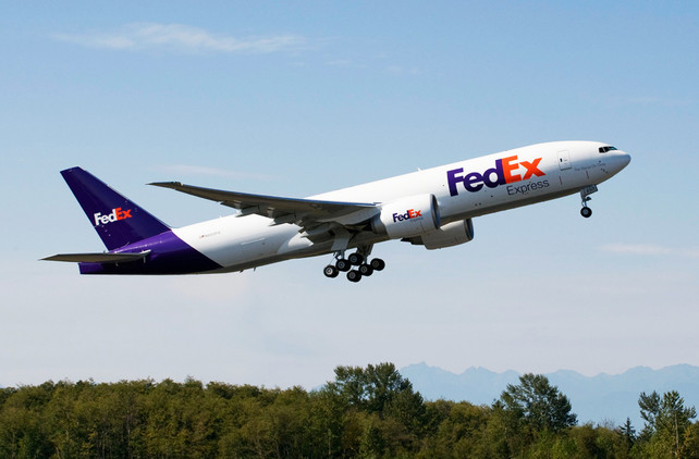
Great article in Fast Company Co.Design, from Michael May’s new book The Laws of Subtraction, on why the FedEx logo is so powerful. It’s the story of Lindon Leader, the designer who created the FedEx logo in 1994 (including getting them to adopt the customer-created shortening of the brand name).

“People thought they shipped only overnight and only within the U.S.,” Lindon explains. “So the goal was to communicate the breadth of its services and to leverage one of its most valuable assets–the FedEx brand.” Lindon remembers that FedEx’s CEO, Fred Smith, placed high value on design and had an intuitive marketing sense: “Any designer worth a lick will tell you great clients make for great design. He said okay to a brand name change and authorized a new graphic treatment. He said do whatever we wanted, under two conditions. One was that whatever we did, we had to justify it: ‘You can make them pink and green for all I care; just give me a good reason why,’ he said. The second one was about visibility. ‘My trucks are moving billboards,’ he said. ‘I better be able to see a FedEx truck loud and clear from five blocks away.’ That was it! So off we went.”
In the book, May asked Lindon to describe his design philosophy. “I strive for two things in design: simplicity and clarity,” he explains. “Great design is born of those two things. I think that’s what we all want from design, and from business, from our work, even from our friendships.”
As he was working, he suddenly saw the arrow formed between the E and the lower case X.
The arrow could connote forward direction, speed, and precision, and if it remained hidden, there might be an element of surprise, that aha moment. “I didn’t overplay it, didn’t mention it. And you know, most of our own designers didn’t see it! But when I previewed the mark along with a few others with the global brand manager, she asked, ‘Is there an arrow in there?’ She saw it, and it was game on!”
I wanted to know more about that aha moment when people got the punch line. I could hear the smile in his voice: “I remember it like it was yesterday.” On April 23, 1994, the Landor team presented their design ideas at FedEx headquarters in Memphis, Tennessee. The hidden arrow mark was one of five presented to a fairly large group of senior executives. “We had built prototypes of planes, vans, and trucks. We would never just show designs on paper unless that was the only application. You need the context. We presented the whole of our work with no mention of the hidden arrow. Our goal was to not reveal it, to see if it got discovered. The global brand manager knew, of course, but kept the secret. Amazingly, Fred Smith was the only one to see the arrow right away. It’s probably why it won. Once everyone saw it, once they got the punch line, they loved it.”
This is a classic kind of “less is more” moment that we wrote about in Nanovation and proof of our point that “less is only more when less is better.” A highly recommended read.


